%%HTML
<script src="require.js"></script>
“The great aim of education is not knowledge but action” ~Herbet Spencer
“Benchmarking enables one to move from an abstract sense of progress to an objective reality” ~Unknown
“If you want to change something, start measuring it” ~Unknown
The OECD Programme for International Student Assessment (PISA) is a collaborative effort among members of the OECD and other participating countries for measuring real-life problem-solving skills after being exposed to compulsory schooling. The foundational aspiration/target is to provide nations with an insight as to how the students are faring against the global community and prompting them to amend the national curriculum such that the students are better equipped for handling future challenges!

From the above graph, we see that the number of participating countries shows an increasing [upward] trend with the number of countries doubling in the twenty-year horizon which indicates the wide acceptance of PISA across the globe!

PBA -> pen-paper based assessment
CBA -> computer based assessment
The plot suggests a couple of things, firstly it shows a sudden amendment in the medium these tests are conducted switching from pen-paper based to computer-based assessment with the inflection coming in 2015. These are further indicative of two things. One is that the majority of the participants in PISA have the necessary technical infrastructure in place for a complete transition. Second, the decrease in the proportion of pen-paper-based participants in the successive years points toward the increasing adoption of computers in schools worldwide. Another weak inference that one can argue about is the digital familiarity of students as one needs to be at a basic familiarity level with computers to be able to take such assessments!
The flatness of the red line until 2012 suggests that there were no countries whose mode of assessment was computer-based and that there was uniformity in the medium of conduction across countries!
import pandas as pd
import plotly.express as px
import gif
df = px.data.gapminder()
df_1 = pd.read_csv('./data/writing_assignment_data.csv')
df_2 = df.merge(df_1,left_on="country",right_on="country")
fig =px.choropleth(df_2, color="Assessment_type", locations="iso_alpha",hover_name="country",animation_frame="year_y", range_color=[0,1])
fig.show()
Here, blue color represents PBA [pen-paper based assessment] and yellow color represents CBA [computer based assessment]
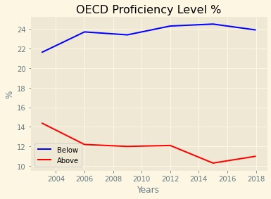
Proficiency level denotes the indexes student based on their performances in particular assessment(s)

The analysis of the above plot reveals an increasing percentage of low scoring students [those who are below level 2 in PISA mathematics proficiency level assessment] over the years
On the other hand, there is a decreasing percentage of students who are top performers[those who are above level 5 in the PISA mathematics proficiency level assessment]!
This plot suggests that the average score is lowering over the years as indicated by the increase in the number of low scoring students which offsets the decrease in the number of top performers by a slight margin of [2-3%]
After segregating OECD and partner nations we see that the percentage of low performers in the OECD nations shows a somewhat stable upward trend and the percentage of top performers also show a similar trend as the overall plot [a decreasing one]!

The partner nations show an irregular increasing trend in the percentage of low performers while a relatively low decrease in the percentage of top performers as compared to their OECD counterparts!
One interesting thing is that the absolute percentage of low performers is high in the partner countries as compared to the OECD ones. While the absolute percentage of high performers is high in the OECD nations, the difference in values is not as stark as that in the percentage of low performers between the two.

The Mean Reading performance Curve shows somewhat of an irregular trend with an increase in 2003 from 2000 and successive decreases in further years with a local peak in 2012. Overall, the mean reading performance showed a decrease of around four percent across the entire time duration from the starting point!

The mean reading scores of 15-year olds in OECD nations also have a narrow fall but the absolute mean score hovers around a high of 490 throughout the duration. So, we can see a stable OECD mean reading score with occasional noise in intermediate years!
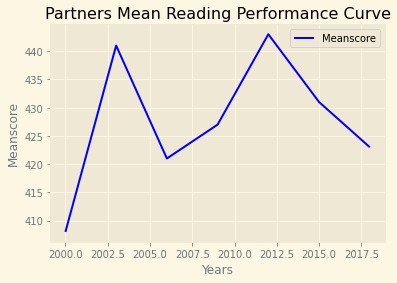
The mean reading scores of partner nations, though less in absolute terms when compared to the OECD nations, have an upward trend with around a three percent increase in 2018 when compared to the starting year of 2000! One other interesting point that we came across is that the overall mean reading score is not indicative of the segregated OECD or partner countries!
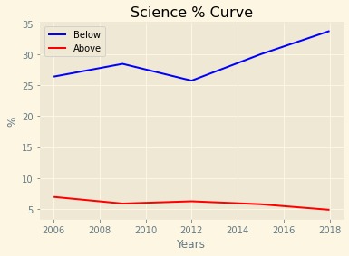
Overall, we observe an increase in the percentage of low scorers in the Science PISA assessment and a decrease in the absolute percentage of top performers

Coming to the OECD nations, we see a slight increase in low performers but not as drastic as the one observed in the overall section. Moreover, there is a slight decrease in top performers which is pretty consistent with the overall scenario.

Similarly, the plot for partner nations indicates a slight increase in low performers while being almost invariant for the number of top performers!
After analyzing the performance across three fields namely Science, Mathematics and Reading we converge on the conclusion that OECD nations perform better than the partner countries which is reflected in the high reading scores and less percentage of low performers and more percentage of top performers!
In Qatar below level 2 was 79.1% in science in 2006 and it is reduced to 48.4% in 2018. In 2006 they were 39.2% below from average and in 2018 they are below average from 3.5% it is Science metric change from 2006 to 2018, Qatar has decreased Level 2 by 30.7 % and Increased level 5 by 1.9% in 12 years!
Chile in 2006, Reading Metric of below level 2 have 31.7% while in Math below level 2 is 51.9% which have a difference of 20.2%
Here, the average time spent in minutes in a day, futher days are segregated into weekdays and weekends!
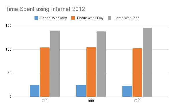
The above bar graph shows the average time used by the students in all countries of PISA in the year 2012. We infer that the time spent is considerably less during school going days as compared to the days when the students are at home.

The above bar graph shows the average time used by the students in all countries of PISA in the year 2018. As we can see from the graph. All average time has been increased significantly approx 75 mins each.

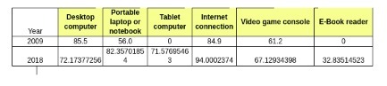
The above graph shows the change in the percentage of devices in each country's students and the availability of internet connection. All the device's availability increased except the Desktop computer. Since there is an availability of more portable laptops and tablets. The Internet has been increased from 85% to 95%. Tablet computers have drastically increased by 71%. Also the E-book reader increased by 32%